Bookshelves can take up a good chunk of real estate in your home and when they do, they become a focal point. They demand attention.
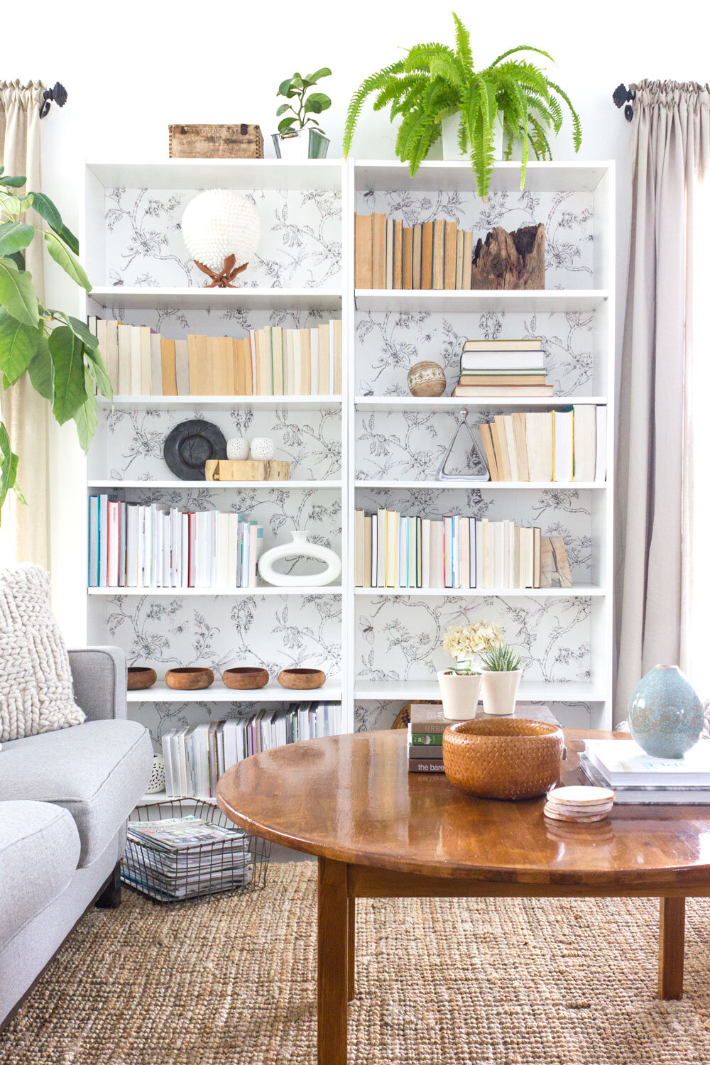
Maybe that’s why they seem so hard to get “right”. Styling bookshelves can be tough, but I think part of the problem is that we overcomplicate it, simply because it’s such a focal point in a room. It can definitely be intimidating!
So let’s simplify it. Really, all you need to do is gather a few things:
- books (as many or few as you want)
- a few framed photographs or artwork
- some mementos, collections or meaningful/beautiful objects
- a plant or something natural
Then, use these tips to help you figure out where to put them on your shelves.
8 SIMPLE TIPS FOR STYLING A BOOKSHELF
1. Make it substantial.
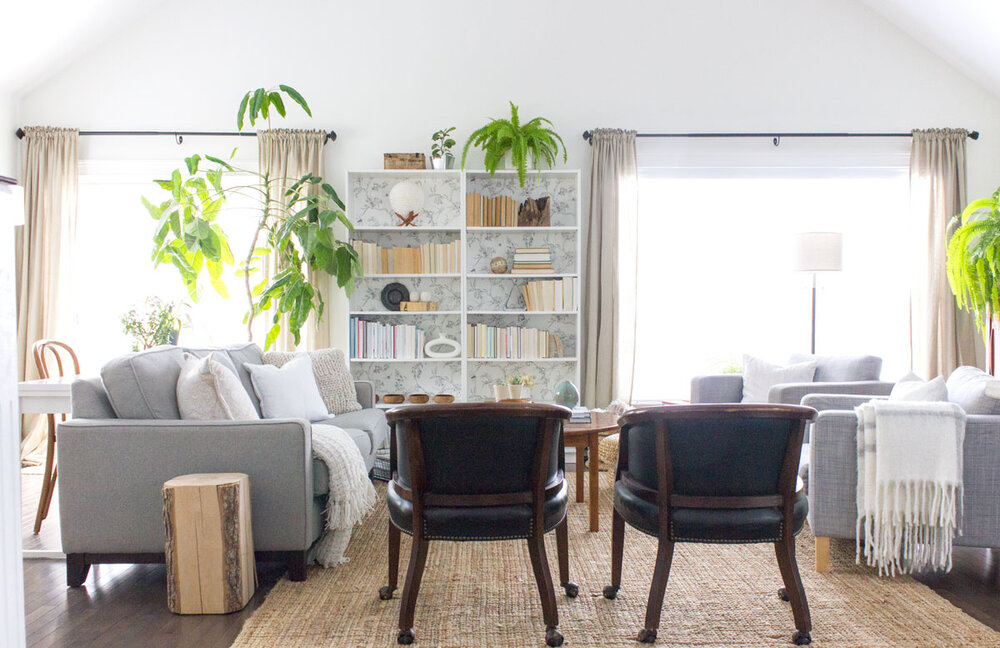
Before you get to work on how to style your bookcase, consider the placement of your bookshelves themselves – and the scale of them for your room. You’ll want it to be a main style element and have enough weight to be important. Here’s an idea: setting two identical bookshelves next to each other will help mimic the look of built-ins and feel grander. Or building them on either side of a TV or fireplace adds to one main focal point.
2. Don’t stuff it full.
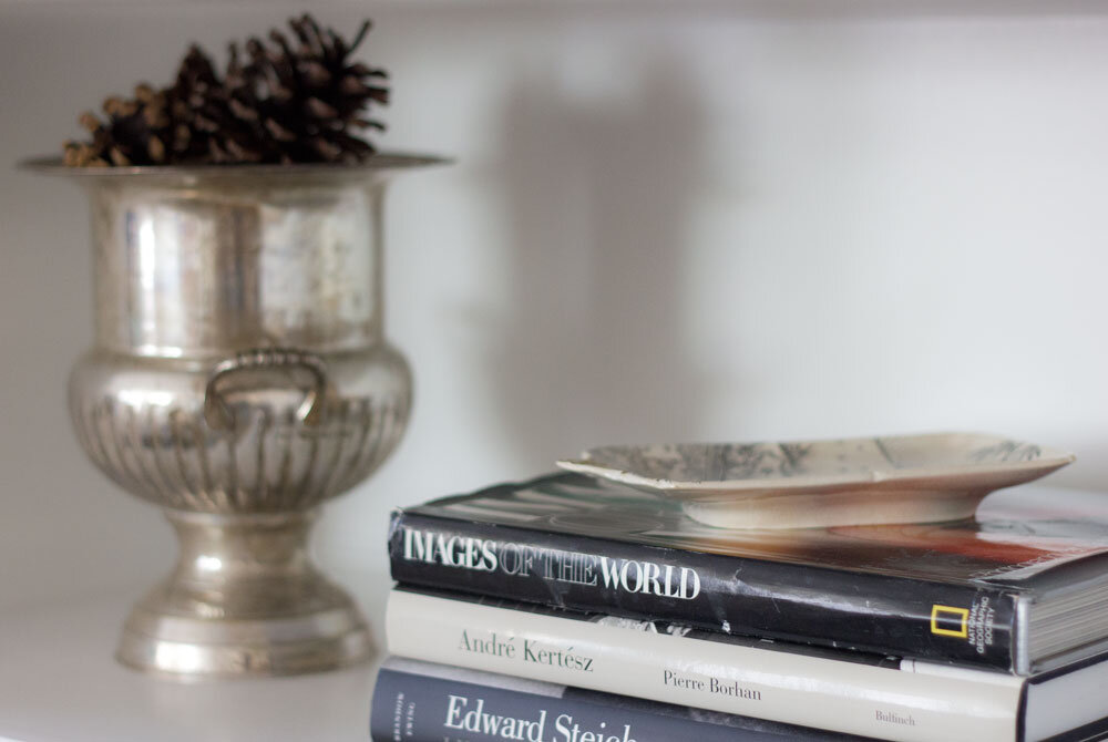
Even if you have lots of books and/or special trinkets to display, try to weed out only the ones you truly love or find another spot for some. You’ll want to mix books with other decorative items and also leave some white space. When you fill your shelves with lots of little things, it’s too much for your eyes and brain to take in, so it just reads it as clutter. You want the things on your bookcase to be seen and appreciated (by you and by others), not ignored.
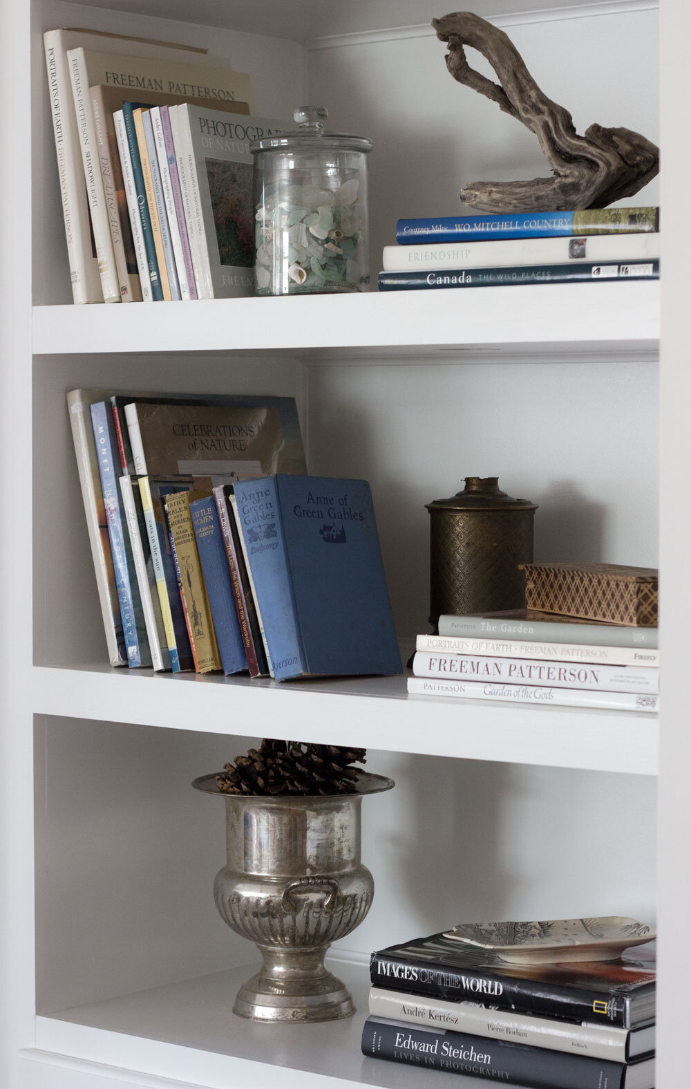
3. Try to find a cohesive colour scheme.
I’m not saying you have to colour your books, but try to find one or two dominant colours to repeat over and over on the bookcase. This will be more soothing to the eye than tons of colours randomly. You might even want to try grouping books by colour per shelf if that looks good to you. Or you might want to go with a very neutral, non-colour scheme.
4. Ground your bookcase.
Put larger items like boxes or baskets or a stack of large coffee-table books at the bottom. The heaviest things (both physically and visually) should go on the bottom shelves.
5. Vary heights and depths.
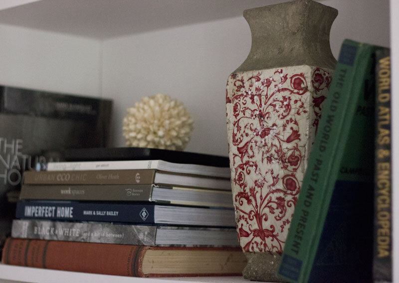
Lay your books both flat and horizontally. Put some decorative pieces closer to the back and some in front. For example, you could lean a photo near the back and put a small object in front of it. Or lean a larger photo and smaller one over top of one another. Add a large bowl or vase to add height. Or stack some books and then add an object on top. Varying the heights and depths creates interest and draws the eye.
6. Use meaningful items.
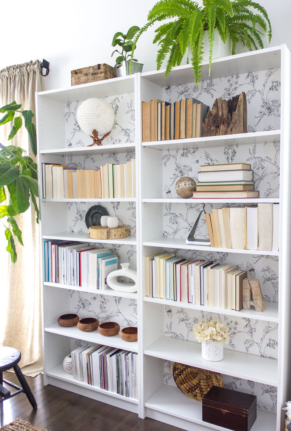
Have a least one or two objects that are meaningful to you mixed in. Maybe that’s a small piece of art or a couple of photos of family or friends. Or maybe it’s a special memento from a trip or period of your life that you loved. These are the things that your eye will be drawn to – so you want them to make you smile!
7. Actually use books!
You don’t have to do this, but if you’re interested in using your bookshelf for actually storing your books all in one spot, use them for that! Just make sure to visually break up the space by stacking some, then laying some flat and leaning some. And mix in a few other little trinkets or natural objects for interest. It makes the space more interesting.
8. Have fun with it!

Do something a little different. Have a minimalist shelf in the mix with only one object on it. Or line up a few of the same objects for an interesting focal display. Or turn your books backward for a change to create a calming monochromatic effect. Maybe add a plant or something from nature on top. And, as always, make sure to use meaningful and/or natural objects that you love within your display.
9. Edit. Edit. Edit.
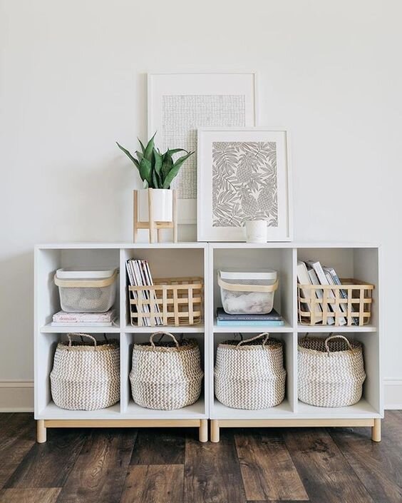
Now stop, and stand back with a critical eye. Get out your phone and take a photo and look at it through that lens. You’ll no doubt see that you need to edit things down once or even three of four times! Don’t overfill it. But also make sure it’s balanced. Does it seem like one side is “heavier” to the eye than the other? Move a few things around so it balances out on both sides.
10. Forget making it perfect.
Your bookshelves are yours. They don’t have to be Instagram worthy. Display what makes you smile, and evolve your displays over time. And keep working on them. You’ll get them to a place where you’re happy.
Take a look at these beautifully-styled bookshelves from around the web as inspiration. Click on photo for source.


Product Relate
Scandinavian Classic Retro Wall Art Classic Movie Coraline Cartoon HD Canvas Poster Print Home Bedroom Living Room Decoration
Funny Toilet Letter Poster Rock and Roll Minimalist Bathroom Canvas Painting Have A Nice Poo Quote Wall Art WC Sign Home Decor
Solar Bubble Balls Lamp String Lights Outdoor Water Drops Outdoor Waterproof Orb Christmas Lights Patio Holiday Party
Nordic Pendant Lamp Modern Clear Glass Pendant Lights Glass Ball Vintage Hanging Lamp for Loft Kitchen Living Room Bedside
Mid-Century Modern Fabric Upholstered Accent Chair with Wood Legs Armchair for Home Office Study Living Room Vanity Bedroom Dorm
$549.02Original price was: $549.02.$492.55Current price is: $492.55.Nordic Modern Style Beautiful Blue Flowers Posters Home Decor Minimalism Canvas Painting Print Wall Picture for Living Room
Animals Mom and Kids Maternal Love Wall Art Canvas Painting Family Nordic Poster Cuadros Wall Pictures For Living Room Unframed
Nordic Ostrich Feather Led Floor Lamp Resin Copper Living Room Home Decor Standing Light Indoor Lighting Bedroom Bedside Light